ONGOING

KASANE
Johana & Himi Line New Train

Scope:

Product design
Concept planning

Launch website:


The overall concept, KASANE, was thoughtfully developed through a deep exploration of the nature, climate, culture, and history of the four cities along the Johana and Himi railway lines. It also reflects a process of reimagining what the future of these lines could be. The layered values embodied in the project—Tradition × Future, Sea × Mountains, East-West × North-South, Daily Life × Tourism—are woven into the design, serving as a symbolic expression of what the future holds for Ainokaze Toyama Railway, the operator at the heart of this initiative.

The train’s exterior features a reflective silver body that mirrors the natural scenery along the route, accented by a flowing gradient of blue and green—colors representing the sea and mountains the line connects. The inspiration for this design comes from the word Ainokaze, also used in the railway’s name. In the ancient Manyoshu poetry collection, Ainokaze refers to the fresh northeastern wind that blows between spring and summer—believed to carry happiness. This gentle yet vibrant wind from Toyama’s coast to its mountains is brought to life in the color gradient. The sculpted front of the train balances safety with elegance, and LED lighting allows for a range of expressive moods.

Inside, a bright cabin with wooden-textured ceilings and flooring evokes warmth and natural beauty. The green seats reflect the lush landscapes outside, creating a sense of harmony between the interior and its surroundings. Looking ahead, there are plans to subtly incorporate local craftsmanship and materials—quiet nods to regional heritage that invite affection and familiarity. The interior also features distinctive round windows, inspired by Azumadachi, the traditional houses of western Toyama. These circular motifs symbolically connect the region’s past and future, as well as its residents and visitors.

By blending enduring design with practical functionality, this train is envisioned to remain beloved across generations—an expressive embodiment of continuity and vitality.

*Visuals and specifications are preliminary and subject to change.


全体コンセプトの「KASANE」は、城端線・氷見線沿線4市の自然・風土・文化・歴史を学び、そして城端線・氷見線の再構築事業のあり方を模索しながら練り上げました。「伝統×未来、海×山、東西×南北、日常×観光」という重層的な価値軸をデザインに反映し、事業主体となる「あいの風とやま鉄道」の未来を、シンボリックに表現しています。
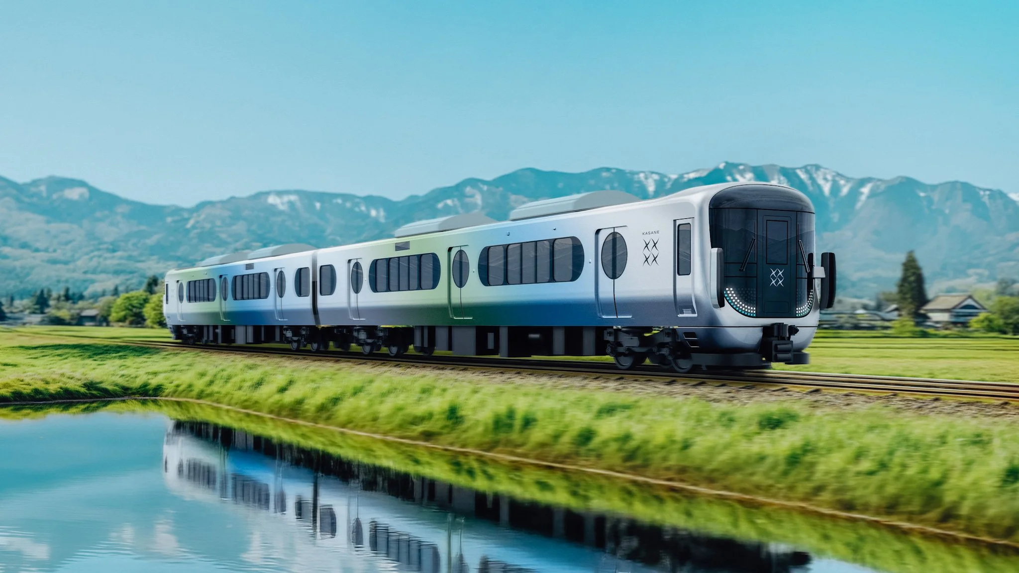
車両外観は、沿線の景色や自然が映り込むシルバーのボディと、海と山を結ぶ路線の特徴を示すブルーとグリーンのグラデーションが特徴です。事業者が名前に採用している「あいの風」に、多大なインスピレーションを得ました。万葉集で詠まれた「あいの風」とは、「春から夏にかけて吹く北東のさわやかな風」、「幸せを運ぶ風」のこと。富山の海から山へ吹く、風の躍動感をグラデーションで表現しています。立体的な前面形状は安全性と審美性を両立させ、LEDライトにより多彩な表情を生み出します。

内装は明るい室内空間に木目の天井・床を配し、沿線の豊かな緑を彷彿とさせるグリーンの座席で内外の一体感を演出。また愛着を醸成する要素として、今後は地場産業の「技」や「素材」をさりげなく取り入れるアイデアもあります。さらに富山県西部の伝統的家屋、「アズマダチ」の円窓をモチーフにした丸窓を取り入れることで、沿線の過去と未来、地元利用者と訪問者をつなぎます。

時代をこえて愛される鉄道車両に不可欠な、「デザインと機能の持続性」を、いきいきとした表現で実現しました。

※掲載図版・仕様は現時点のイメージであり、今後変更となる場合があります。

  • Client: Johana & Himi Line Reconstruction Council (Toyama Prefecture, Takaoka City, Himi City, Tonami City, Nanto City, West Japan Railway Company, Ainokaze Toyama Railway Company)

    Design: Keita Suzuki, Ryuya Yamada (PRODUCT DESIGN CENTER)

    Year: 2025 –

    Status: Ongoing

  • クライアント: 城端線・氷見線再構築会議(富山県、高岡市、氷見市、砺波市、南砺市、西日本旅客鉄道株式会社、あいの風とやま鉄道株式会社)

    デザイン: 鈴木啓太、山田竜也(PRODUCT DESIGN CENTER)

    年: 2025 –

    ステータス: 進行中

次へ
次へ

MINORI | 2024